Blog · · 7 min
Bundle quantity selector component for React
The React implementation, in full: a RadioGroup over a tier array, the props, the accessibility markup, the selected and focus states, the mobile layout and the button binding. The commercial reasoning behind the tiers is a separate page.
By uxgen
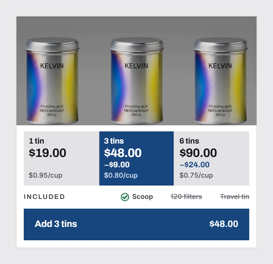
A bundle quantity selector is a radio group of cards, not a quantity stepper. Three or four tiers, one of them preselected, each card showing the total, the price per unit underneath, and the saving expressed in money rather than only a percentage. The most common implementation mistake is building it as a + / − stepper, and it is the mistake that makes a store look improvised. A stepper asks the customer to do arithmetic. A tier card does the arithmetic for them and makes the middle option obviously correct.
No general-purpose React library ships it. We read the category indexes on 24 August 2026. Tailwind Plus lists 14 ecommerce categories and 84 components, none of them a quantity tier selector. CommerCN lists eight categories (checkouts, carts, reviews, orders, categories, product details, products, promo banners) and none is this. shadcnblocks has ecommerce categories for product list, product detail, product card, shopping cart and checkout, and its pricing blocks are SaaS plan tables. Every library stops at the SaaS pricing table, which looks superficially similar and behaves completely differently.
Why a radio group and not a stepper
A stepper models how many units do you want. A tier selector models which offer are you taking. Those are different questions and they produce different revenue.
With a stepper, the customer starts at 1 and every increment is their own decision, unassisted. With tiers, the middle option is presented as a resolved choice (someone already worked out that three is the sensible number) and the customer's job shrinks to accepting or declining it. That is also why the tiers must not be a dropdown. A dropdown hides the comparison, and the comparison is the entire mechanism.
Semantically it is a radio group, so build it as one. A fieldset with a legend, then one label per tier, each wrapping a visually hidden input type=radio sharing a name. The card is styled from the input's :checked state. Do not reach for div plus onClick plus role=radiogroup. You will reimplement arrow-key navigation badly, and the native version gives you keyboard support, form submission and screen reader announcement for free.
The spec
Three or four tiers. Never two, rarely five. Two tiers is a yes-or-no question and loses the anchoring effect entirely. Five is a decision the customer postpones. Three is the working default. Four is defensible when the product is genuinely consumed in a cycle, such as a monthly supplement.
Non-linear gaps between tiers. If tier 1 is 0% off, tier 2 is 10% and tier 3 is 20%, the customer reads a straight line and infers that a bigger tier would be better still. Uneven steps (0%, 15%, 22%) make the middle tier read as the deliberate one. The related pricing rule is that the top tier should improve on the middle tier by clearly less than the middle improved on the bottom. The ladder should visibly flatten, so the middle is where the value peaks.
Total price large, unit price small and directly underneath. The unit price is what makes the discount legible without mental arithmetic. Format it as price per unit of the thing the customer thinks in (per bottle, per vial, per month), never per gram.
The saving in currency, then the percentage. "Save 24 euros" is a number a person can spend. "Save 15%" is a ratio they have to convert. Show both, money first.
One tier preselected, and it is the middle one. An unselected group is an unanswered question and it suppresses the add-to-cart. Preselect the tier you actually want to sell and label it ("most popular", "best value") with a badge that sits on the card border, not floating above the layout.
Prices come from the server. Compute the tier totals where the cart computes them. A selector that multiplies client side will eventually disagree with the checkout by a cent, and a price that changes between the product page and the checkout is the fastest way to lose a completed order.
Mobile, which is where this actually lives
At 390 pixels the three cards must stack vertically, not shrink into a row. A row of three cards at that width leaves each one about 118 pixels wide, and the unit price becomes unreadable. At that point the whole mechanism is decorative.
Each card needs a tap target of at least 44 by 44 points. The selected state must be carried by more than colour: a border weight change, a check mark, or a filled radio dot, so it survives both a colourblind reader and a phone in sunlight.
And do not animate the price when the tier changes. A number that counts up is the most common tell of a generated storefront, it delays the information by several hundred milliseconds, and it makes the price feel negotiable.
What breaks it
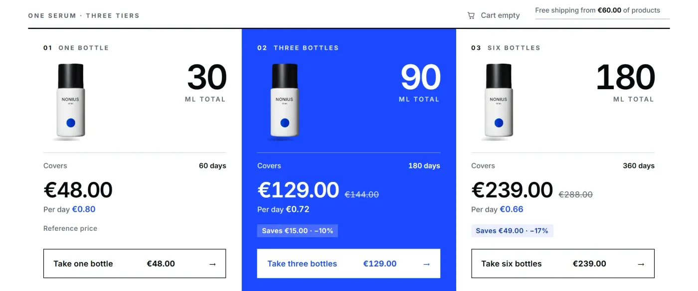
- Percentages only, no money. Forces arithmetic at the exact moment you want the decision to be effortless.
- A discount that also appears as a strikethrough on the base price. Two discount mechanics in the same block read as a trick.
- A countdown attached to the tier. Unless the deadline is real and enforced, this is a fabricated urgency claim and in the EU it is a listed unfair commercial practice, not a growth tactic.
- Tiers that change the shipping promise. If tier 3 unlocks free shipping, that belongs in a separate progress element, not buried in a card.
- The selector below the fold on mobile. If the customer has to scroll past the add-to-cart to find the offer, the offer does not exist.
The order of the block
Top to bottom, on the product page: gallery, name, price, tier selector, add to cart, then the reassurance line (shipping, returns). The selector sits above the button because the button's label should be able to reflect the choice. "Add 3 bottles, 78 euros" confirms a decision rather than starting one.
If you are adding a complement after the add-to-cart, that is a different component with different rules, and the placement matters more than the offer.
Disclosure. We are building uxgen, an MCP that hands an agent components of this kind, and our version of this one is shown playing in the component library. It is not installable yet, and the spec above is free to copy either way.
FAQ
Is there a React library with a bundle quantity selector?
Not in the general-purpose ones. shadcn, Untitled UI, daisyUI, Relume and 21st.dev all stop at the SaaS pricing table. What you find under this name is usually a quantity stepper, which is a different component answering a different question.
Why is a stepper the wrong component?
A stepper asks how many, so the buyer has to do the arithmetic and nothing suggests two is better than one. A radio group of named tiers asks which package, and one of them is visibly the sensible choice. That change of question is the whole mechanic.
How should the tiers be priced?
Non-linearly. One, two, four rather than one, two, three, because even steps read as a price list while uneven ones read as composed offers. Show the unit price under the total and the saving in currency, not only as a percentage.
Which tier should be selected by default?
The middle one, the same one carrying the badge. Defaulting to the cheapest is a recommendation to spend the least, and the selected state is read as a recommendation whether you meant it or not.