Blog · · 7 min
Why every AI generated landing page looks alike
Because a model with no constraint converges on the median of its training corpus. Indigo, Inter, three cards, one radius, a violet gradient. The tells are known and fixable. The part nobody covers is the commercial version of the same failure, where the sameness costs money.
By uxgen
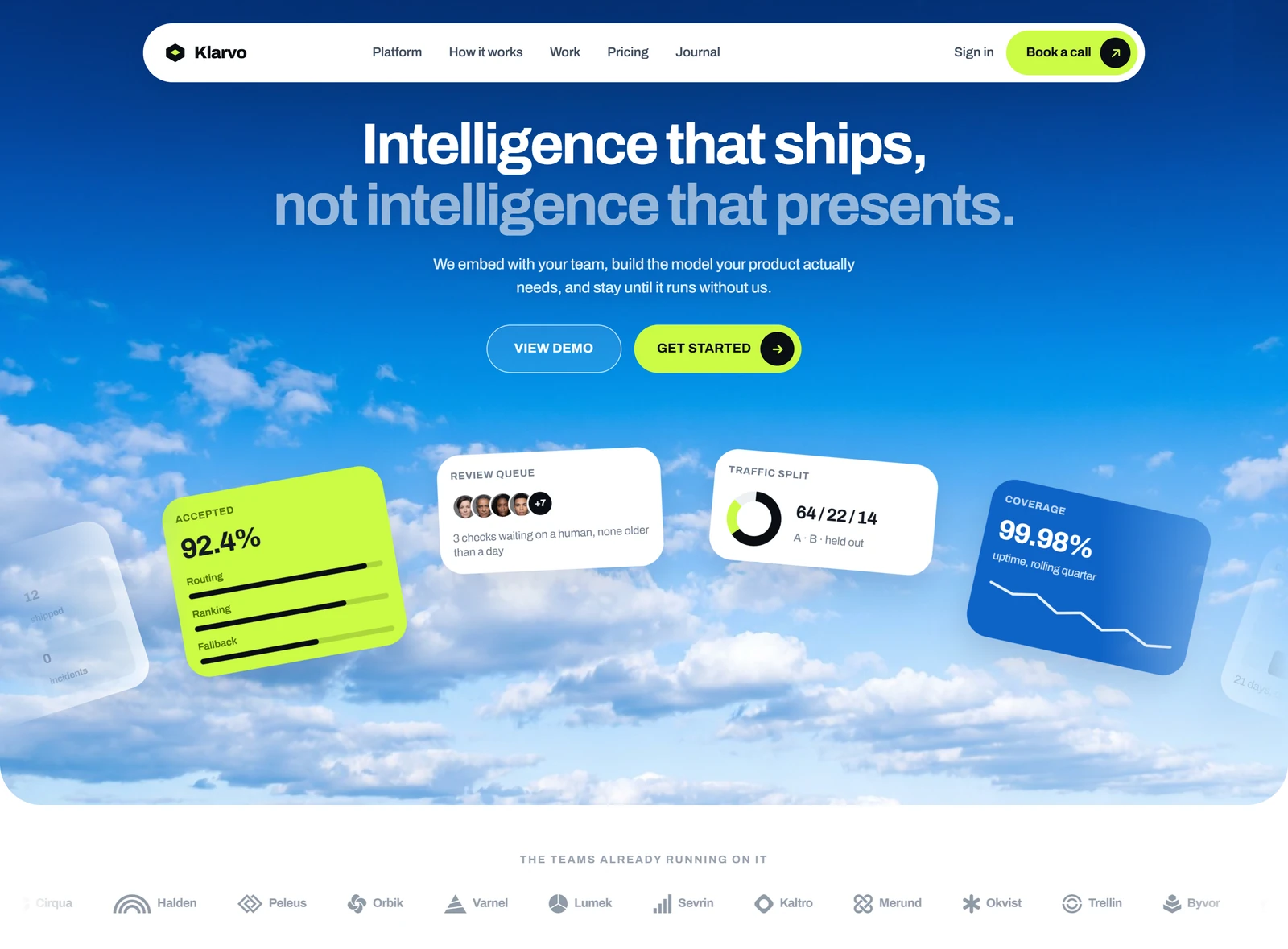
A coding agent asked for a landing page with no further constraint returns the statistical centre of everything it has seen. A violet-to-indigo gradient, Inter or the system stack, a three-card feature row, one border radius applied to every surface, a hero with a centred headline and two buttons, a testimonial row, a pricing table. Nothing in that list is a mistake in isolation. The problem is that it is a default (the output of a process where no decision was made), and the absence of decision is what readers detect, not any single element.
Which means changing tools does not fix it. A different model with the same empty brief converges on the same median. What fixes it is supplying the constraint the brief was missing.
The visual tells
These are well documented. The strongest public write-up we measured at position 1 for this query is Developers Digest's catalogue of patterns that mark an app as vibe-coded, and it is worth reading in full. The condensed version:
- The gradient. Violet to indigo, at 135 degrees, behind the hero. It is the single most reproduced element in the corpus.
- One radius everywhere. Cards, buttons, inputs and images all at the same rounding. Real design systems use at least two scales, because a 4-pixel radius on a button and a 16-pixel radius on a card are different objects.
- Three cards. Three, always three, evenly weighted, each with an icon in a tinted square.
- The default type stack. Inter, or
ui-sans-serif, system-ui. It is the answer a model gives when no answer was chosen. - Even spacing. Every section separated by the same vertical gap, so nothing is emphasised and nothing recedes.
- Icons as decoration. A lucide glyph above each heading that carries no information.
- Copy that describes the category, not the product. "Streamline your workflow." Replaceable with any competitor's name and still true.
Fixing those raises the floor. It does not produce a good page. The checklist gets you out of the tell, not into taste.
The version nobody writes about
If the page is selling something, there is a second list, and it costs more. These are the defaults a model reaches for when a brief says "product page" without saying anything else. They do not look wrong. They just do not sell.
One photograph of the product, and it is a render. The most reliable signal that a store is real is a second view of the same object. The product held, in use, next to something for scale, photographed under a different light. A single floating packshot on a neutral field is what a generated store always produces, and it is what a customer reads as "this may not exist".
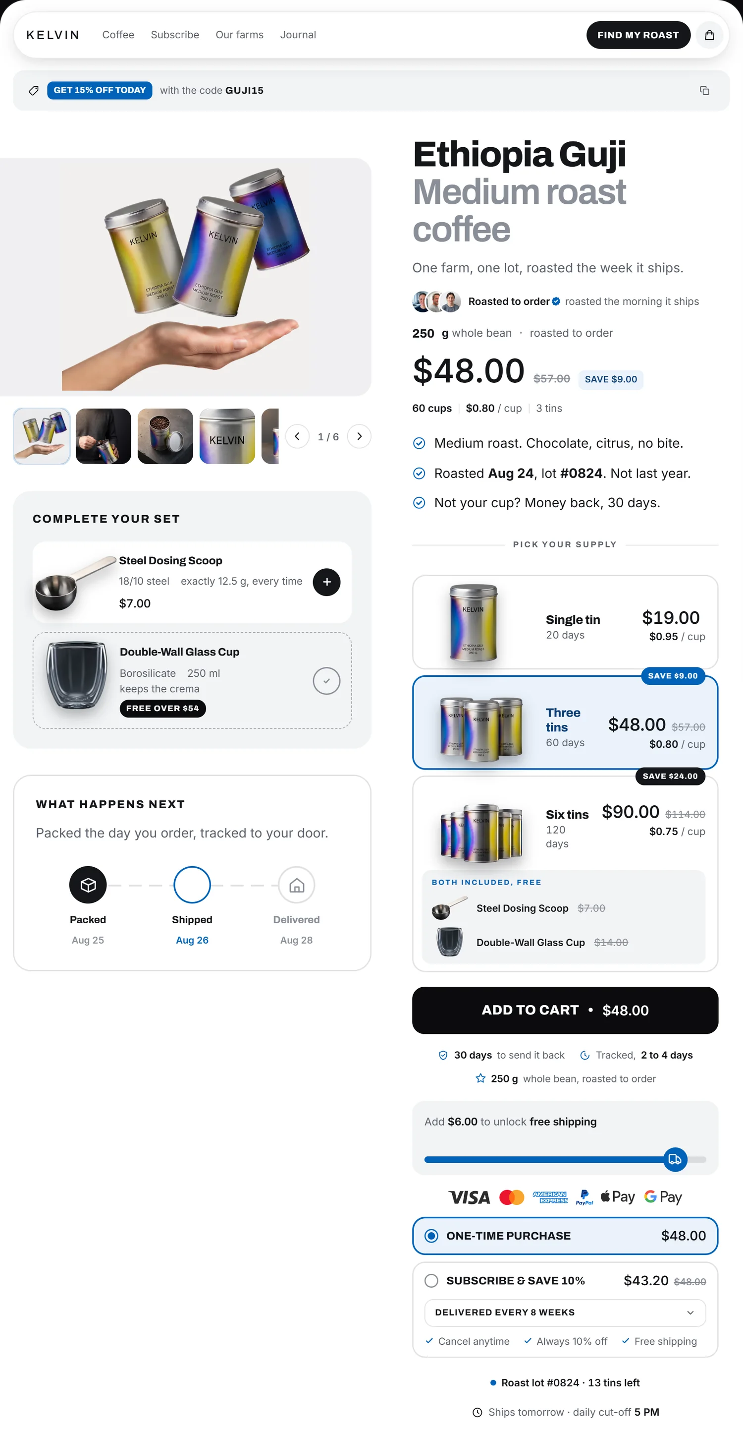
The bundle built as a stepper. A + / − control next to the price, so the customer does their own multiplication and lands on 1. The DTC pattern that actually raises the basket is a tier selector as a radio group, with the middle option preselected. Generated pages almost never produce it, because no component library contains it.
No shipping threshold anywhere. The single cheapest mechanism in commerce ("12 euros more for free shipping", with a bar) is absent from generated storefronts, because it needs a cart total, a threshold and a rule, and none of those are in the layout.
Reassurance that is a row of grey badges. Three icons saying "Secure payment", "Fast shipping", "Money-back guarantee", none of them tied to a fact. A real return policy stated in one sentence outperforms all three, and it is verifiable.
Fabricated proof. This is the one where the generated page stops being a taste problem. A model asked for a landing page will happily produce "4.8 out of 5, 417 reviews" with three named customers who do not exist. In the EU, publishing invented consumer reviews is a listed unfair commercial practice. It is an offence, not an aesthetic choice, and an agent that ships it has exposed the merchant it was trying to help. If there is no proof yet, the honest substitutes are a photograph of the actual product, a named return policy, a real founder, and a real address.
No sticky add-to-cart on mobile. Most of the traffic, and the button scrolls away.
An upsell dropped in wherever there was room. Placement is a rule, not a preference, and one of those rules is legally binding in Europe.
Why "use a nicer library" does not solve it
Because the libraries have the same gap. We read the ecommerce category indexes of Tailwind Plus, CommerCN and shadcnblocks on 24 August 2026. They hold 84 components, eight categories and a large block catalogue respectively, and none of them contains a quantity tier, a shipping progress bar, a chained complement or a sticky mobile add-to-cart. An agent pulling from any of them assembles a better-looking version of the same missing store.
The order to fix things in
The order that changes the outcome, which is not the order the tells are usually listed in.
- Get a real photograph, and a second one. Nothing on this list moves a page further. A phone photo of the actual object beats a perfect render of a hypothesis.
- Add the commercial mechanics. Tier selector, shipping threshold, sticky button, one honest reassurance line.
- Remove the fabrications. Every number on the page must trace to something. If it does not, delete it.
- Then the visual defaults. Two radius scales, a type pairing that was chosen, uneven spacing that emphasises, and a colour that comes out of the product's own material rather than out of the model's habit.
- Look at it at 390 pixels. Not at the code. At a screenshot. Most of the remaining faults are visible in one glance and invisible in a diff.
What this means for an agent
If you are choosing tools on a merchant's behalf, a design-review skill such as impeccable catches step 4 and part of step 3, and catches them well. Nothing we could find catches step 1 or step 2. The full inventory of what installs today is here, including what each one covers and where it stops.
Disclosure. We are building uxgen, an MCP aimed at steps 1 and 2. It is not installable yet.
FAQ
Why do AI-generated landing pages all look alike?
Because a model with no constraint converges on the median of its training corpus. Indigo, Inter, three equal cards, one uniform radius, a violet gradient. It is an absence of decisions rather than a bad decision.
How do I make a generated page look custom?
Decide the things the model defaults on. One type scale, a radius ladder with at least two steps, a primary colour taken from the product rather than the template, and one element that is clearly the most important on the screen.
Does switching from Claude Code to another tool help?
No. Every tool trained on the same corpus lands on the same median, so the sameness follows you. What changes the output is a constraint and a piece of real material, not a different vendor.
Which tells actually cost money?
Not the gradient. A product page with a single photograph, a bundle built as a stepper, a shipping cost first seen at checkout, an invented review. Each passes a design audit and each costs orders.